



















What is in this SaaS pricing page template?
A SaaS pricing page template is the order of blocks and the questions each block has to answer, so the page helps a buyer pick a plan instead of just listing prices. This one has six blocks: the header, the plan cards, the feature comparison table, proof and trust, the pricing FAQ, and the closing path to buy or talk to sales.
We wrote it as copyable text on purpose. Most free Webflow SaaS templates give you a pretty layout with placeholder tiers, and the hard part, deciding what each plan is called, who it's for and what it says, is left blank. Do the words first, then the layout is quick in any tool. Our guide to the SaaS pricing page covers the strategy behind each choice.
How do you use the template?
Settle the pricing model first
Decide tiers, the value metric (seats, usage, projects) and whether you show prices at all. If you're unsure, read should you show pricing on your website before you write a word.
Copy the six blocks into a doc
Keep the headings below and write under each one. Leave a note wherever you need a decision from founders or finance.
Fill in the plan card spec for every tier
Use the same fields for each plan so the cards compare cleanly side by side.
Collect the real objections
Ask sales and support which pricing questions they hear most. Those become the FAQ.
Build and check it on a phone
Most of the layout problems on pricing pages show up on small screens: stacked cards, wide tables and a toggle that scrolls out of view.
Block 1: The pricing page header
- Headline: say what the buyer gets or who the plans are for, not just "Pricing". For example, "Plans for teams from 5 to 500".
- Subheadline: one sentence on the value metric, such as "Pay per active seat. Add or remove seats any time."
- Billing toggle: monthly and annual, with the annual saving stated plainly. Our note on the annual vs monthly pricing toggle covers the default to choose.
- Audience switch (optional): only if you truly sell different plans to different buyers, for example startups and enterprise.
- Trial or free plan line: if there is one, state it here, with whether a card is required.
Block 2: The plan cards
Each plan card answers one question: is this plan for me? Use the same fields on every card and keep three or four tiers at most, because every extra card makes the choice harder. Our guide to pricing tiers explains how to split them.
Field | What to write | Example prompt |
|---|---|---|
Plan name | A name that signals the buyer, not a metal | Starter, Team, Business |
Who it's for | One line naming the buyer and size | For teams up to 10 people |
Price | The number, the unit and the billing period | $__ per seat / month, billed annually |
Key limits | The 2–3 limits that decide the upgrade | __ projects, __ GB, __ API calls |
Top features | 4–6 items, starting with what's new vs the tier below | Everything in Starter, plus… |
CTA | A specific action, different per tier if needed | Start free trial / Talk to sales |
Highlight | Mark one plan as the default choice and say why | Most teams start here |
Block 3: The feature comparison table
The comparison table is for the buyer who has narrowed down to two plans and needs the detail. Put it below the cards, group rows by job, and keep the plan names in a sticky header so people never lose track of which column is which. Our deep dive on the pricing comparison table has layout patterns.
- Row groups: for example Core features, Collaboration, Integrations, Security and admin, Support.
- Cells: a check, a dash or a short value ("5 seats", "Unlimited"). No paragraphs in cells.
- Tooltips: a one-line definition for any feature name a new buyer wouldn't recognize.
- Mobile: show one plan at a time with a plan switcher, or let the table scroll sideways with the feature column fixed.
Block 4: Proof and trust near the price
The pricing page is where doubt peaks, so put proof right next to the decision. Use what you really have, and never invent logos, numbers or quotes.
- Logo row of customers who agreed to be shown.
- One or two short testimonials about value for money or ease of rollout, with name, role and company.
- Security line: the certifications or reports you actually hold, linked to your trust page.
- Risk reducers: trial length, cancellation terms, refund policy or a migration offer, stated exactly as they work.
Block 5: The pricing FAQ
Write the FAQ from the questions sales and support already answer every week. Each answer should be two to four plain sentences that work if quoted alone. That matters more now that many buyers start their research in AI chatbots, because clear text answers about price are what those tools can read and repeat. See our pricing page FAQ guide for more.
- What counts as a seat, a user or a unit of usage?
- What happens if we go over a limit?
- Can we switch plans or cancel at any time, and how is it prorated?
- Do you offer discounts for startups, nonprofits or annual billing?
- What payment methods and currencies do you accept, and do you invoice?
- Is there a free trial, and what happens when it ends?
- How is our data handled, and where can we see your security documentation?
Block 6: The closing path and the enterprise option
End the page with two clear routes: start on a self-serve plan, or talk to someone. The enterprise or custom tier usually sits here, with what it adds (SSO, contracts, support terms, volume pricing) and a sales CTA. If the product is sales-led, link a book a demo page built for that one action rather than a generic contact form.
Hypothetical example: a filled-in header and plan cards
For example, suppose a seed-stage scheduling tool for clinics fills in blocks 1 and 2.
Header: "Scheduling plans for clinics of every size." Subheadline: "Priced per practitioner. Add or remove practitioners any time." Toggle defaults to annual, labelled "2 months free". Trial line: "14-day free trial, no card required."
Cards: Solo (for one practitioner, $__ per month, online booking and reminders, CTA Start free trial). Clinic, highlighted as "Most clinics start here" (for 2 to 20 practitioners, adds shared calendars, intake forms and payments, CTA Start free trial). Group (for multi-site groups, custom pricing, adds SSO, a data processing agreement and a named contact, CTA Talk to sales). The numbers are placeholders: the point is that every card answers who it's for before it lists features.
How do you build this pricing page in Webflow, Framer or Next.js?
All three can build every block. The differences are in how you keep plan data in one place and how easy the toggle and table are to maintain. Platform features change, so check the current docs before you commit to an approach.
Block | Webflow | Framer | Next.js |
|---|---|---|---|
Plan cards | A component, or a CMS collection for plans | A component with variants, or the CMS | A component fed from one plans data file |
Billing toggle | Tabs or interactions swapping two price sets | Component variants switched on click | React state, prices from the same data file |
Comparison table | Built by hand or from CMS fields | Built by hand; long tables get heavy | Generated from data, easy to keep in sync |
FAQ | An accordion component | An accordion component | An accordion plus FAQ markup from the same source |
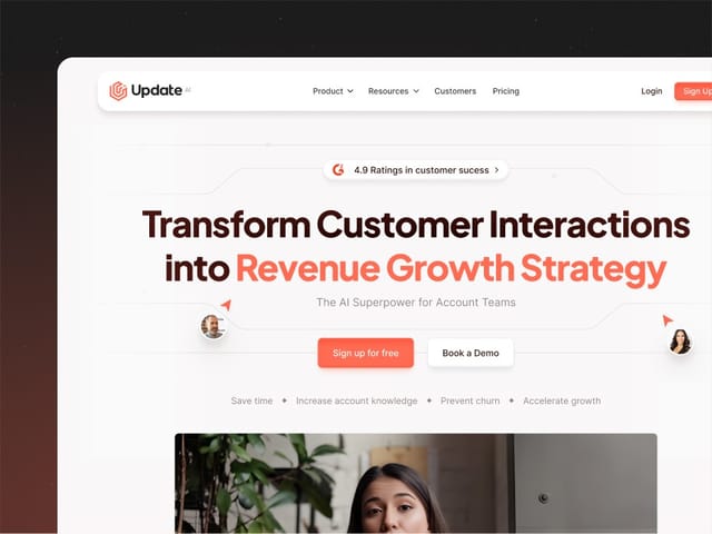
If your pricing changes often or you have many plans, keeping the numbers in one data source matters more than the tool. We build pricing pages as part of our SaaS website design work: we designed and built the sites for Update.ai and Minexa AI. Our website package is $8,000 fixed for up to 6 pages, plus $500 per extra page, with copywriting, custom design, a Next.js build, a CMS and animation. If you're staying on Webflow, see our Webflow development service. Either way, the next step is a free 30-minute call.