

















Why wireframe a landing page in words before Figma?
A landing page wireframe is the plan of a page: which sections it has, in what order, and what each one says. Doing it in words first is faster than in Figma, because the hard decisions on a landing page are about the message, not the layout. A beautiful template filled with vague copy still converts poorly.
Most free landing page Figma templates give you boxes labelled "Headline goes here". This template gives you the questions those boxes have to answer. Once the words exist, choosing a layout gets much faster. Our guide to landing page wireframes covers the method in more depth, and wireframe vs mockup vs prototype explains where this step sits in a design process.
How to use this landing page wireframe template
Copy the sections into a doc
Paste the ten sections below into a Google Doc or Notion page, one heading per section.
Answer the questions, not the layout
Write real words under each heading. Ugly and long is fine at this stage.
Cut to the word guides
Trim each block to the length suggested. If a section has nothing true to say, delete it.
Read it top to bottom as a buyer
Check that every question a skeptical visitor would ask is answered before the final CTA.
Then pick a template or a designer
Map each section to a block in your Figma, Framer or Webflow template, or hand the doc to whoever designs it.
Sections 1–3: The hero, the proof bar and the problem
The top of the page has one job: tell the right visitor they're in the right place, and give them one action. Our hero section design guide and landing page headline guide go deeper on each line.
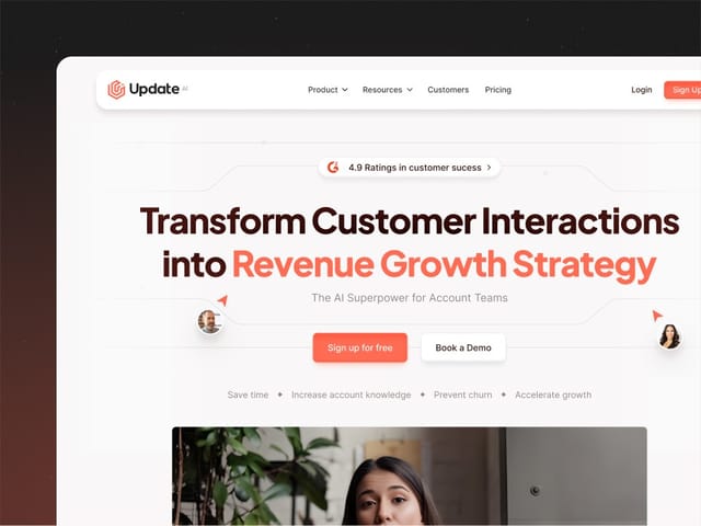
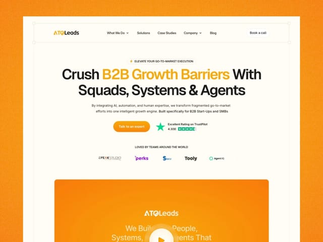
- Hero. Headline (6–12 words): what you do, for whom, in the buyer's words. Subheadline (15–30 words): how it works or the outcome. One primary CTA with a specific label, such as "Book a demo" or "Start free". One visual that shows the product, not a stock image.
- Proof bar. Customer logos, a rating with its source, or a notable investor or press mention. Only real ones. If you have none yet, skip this block rather than faking it.
- Problem. Two to four sentences, or three short bullets, describing the situation your buyer is in today and what it costs them. Use their language from sales calls, not yours.
Sections 4–6: How it works, benefits and the product
- How it works. Three steps, each with a short title and one sentence. If your product needs more than three steps to explain, the page probably needs a demo video instead.
- Benefits. Three to five outcomes, each with a one-line heading and one or two sentences. Write each as what the buyer gets ("Close the books in two days"), then name the feature that delivers it.
- Product detail. A screenshot, short video or interactive demo with captions that point at what matters. Show the screen your buyer would use on day one.
These sections answer "will this work for me?". Most landing pages are too long here and too short on proof. See our landing page structure guide for how to decide which blocks a given page needs.
Sections 7–8: Social proof and objections
- Social proof. One to three testimonials with a full name, role and company, ideally with a photo. A short case study line (the customer, the problem, what changed) beats a generic quote. Our social proof guide covers what to use when you're early.
- Objections and FAQ. The four to six questions that come up on every sales call: price, setup time, security, integrations, switching cost, contract length. Answer each in two or three plain sentences.
Sections 9–10: The offer and the final CTA
- Offer or pricing. What the visitor gets, what it costs (or how pricing works), and what happens after they click. If price is "talk to sales", say what the call covers and how long it takes.
- Final CTA. Repeat the headline promise in one line and the same primary action as the hero. If there's a form, ask only for what you need to follow up. Our landing page form guide covers field counts and labels.
Section | Question it answers | Typical length |
|---|---|---|
Hero | Am I in the right place? | Under 50 words |
Proof bar | Do others trust them? | Logos or one line |
Problem | Do they understand my situation? | 30–60 words |
How it works | How hard is this? | 3 steps |
Benefits | What do I get? | 3–5 items |
Product detail | What does it look like? | 1 visual + captions |
Social proof | Did it work for people like me? | 1–3 quotes |
Objections | What's the catch? | 4–6 questions |
Offer and final CTA | What do I do now? | Under 40 words |
How do you turn the wireframe into a Figma design?
Map each section of your doc to one block, then lay them out at desktop and mobile widths from the start. Keep one primary CTA style throughout, so the visitor never wonders which button matters. Check that the hero, its CTA and the start of the proof bar read clearly on a phone without scrolling far; our above-the-fold guide explains what matters there.
- Use real copy, never lorem ipsum. Placeholder text hides layout problems that real headlines create.
- Design the mobile hero first. It's the tightest space and forces the clearest message.
- Limit the page to one goal. Secondary links pull attention from the CTA. Our guide to how many CTAs a landing page needs covers when a second one helps.
- Grade it before you build it. Run the draft through our free landing page grader, a 20-point self-check across message, proof, CTA, form, speed and trust.
Hypothetical example: a filled-in hero and problem section
For example, suppose a seed-stage startup sells an AI tool that writes first drafts of security questionnaires for B2B sales teams.
Hero headline: "Answer security questionnaires in hours, not weeks." Subheadline: "Upload past answers and your policies, and get a cited first draft of every new questionnaire for your security team to review." CTA: "Book a demo". Visual: the review screen, with a suggested answer and its source document highlighted.
Proof bar: skipped, because the company has two pilot customers who haven't agreed to be named.
Problem: "Every enterprise deal stalls on a 200-question spreadsheet. Your security lead answers the same questions again, and sales waits." Short, specific and in the buyer's words.
When should you hire someone instead of using a template?
A template is the right call when the page is a test, the budget is small, and someone on your team can write the copy. Hire it out when the page carries paid traffic or a launch, when you need custom product visuals or animation, or when nobody has time to write. The words are usually the bottleneck, not the layout.
Our landing page design service is $6,000 fixed: the copy, a custom design and an animated Next.js build, starting from exactly this kind of outline. Delivery time is scoped on the intro call. If you'd rather start with the full homepage, our startup homepage template is the multi-section version of this outline. The next step is a free 30-minute call.