



















What does a design system agency deliver?
A design system agency delivers the shared parts your product and marketing site are built from: tokens, components, patterns and the rules for using them. The useful version exists in two places at once, a Figma library your designers pull from and a component library your engineers import, and both use the same names.
Most systems fail in the gap between those two places. A designer updates a button in Figma, nobody changes the code, and six months later the two have quietly forked. Because our team writes the code as well as the designs, we build both sides together and keep them in step.
Deliverable | What it covers |
|---|---|
Design tokens | Color, type, spacing, radius, shadow and motion, as primitive and semantic tokens |
Figma variables and modes | Tokens set up as Figma variables, with light and dark or brand modes where you need them |
Figma component library | Components with variants, properties and auto layout that match how the code behaves |
Coded components | React components in your stack, typically with Tailwind or CSS variables wired to the tokens |
Patterns | Forms, tables, empty states, navigation and page sections assembled from the components |
Documentation | Usage rules, do and don't examples, and props, written for people and coding agents |
Governance | How new components get proposed, reviewed and released, sized for a small team |
Do you need a design system yet?
You need a design system when inconsistency starts costing you time: the same component rebuilt three ways, designers redrawing screens engineers already shipped, or a rebrand that means touching hundreds of files. Before that point, a lighter setup is usually the better spend.
Startup design-system advice we reviewed in our 2026 product research has shifted toward starting with an off-the-shelf base such as shadcn/ui and deferring a custom system. The thresholds those guides commonly cite are two or more designers or three or more engineers. We agree with the direction, and we'll tell you on the call if you're early.
Pros
- Product and marketing screens stay consistent as more people ship
- New pages and features get built from parts instead of from scratch
- A rebrand or dark mode becomes a token change, not a redesign
- Coding agents produce on-brand UI when the components and rules are clear
Cons
- It's a real investment that pays back only if several people use it
- A system nobody maintains drifts and becomes a second source of truth
- Too early, it freezes decisions your product hasn't settled yet
Our guide to design systems for startups goes deeper on when to start and what the minimum version looks like, and shadcn/ui vs a custom design system covers the most common first decision.
How we build a Figma design system and component library
We build from the product you already have, not from a blank canvas. The first job is finding what's already repeated, because the components your team uses every day are the ones worth systematizing first.
Audit
We inventory your live product, marketing site and Figma files, and group what's repeated: buttons, inputs, cards, tables, modals and page sections. You get a list of what exists, what's duplicated and what's missing.
Tokens
We define primitive tokens (the raw palette and scale) and semantic tokens (what each value is for), then set them up as Figma variables with modes where needed.
Core components
We design the highest-use components first, with variants and properties that mirror the props engineers will use, so the Figma library and code share one vocabulary.
Code
We build the same components in your codebase, wired to the tokens, and replace the duplicates in your product as we go.
Docs and rules
We write usage guidance for each component: when to use it, when not to, and examples. We write it so a new hire or a coding agent can follow it.
Adoption
We migrate real screens onto the system and set up a lightweight review process, so the system grows with the product instead of sitting beside it.
How do tokens move from Figma variables to code?
Tokens move from Figma to code through a shared naming scheme and an export step, not through hand-copied hex values. We name each token once, use that name as the Figma variable, and generate or map the matching CSS variables or theme values in your code.
For a Tailwind v4 project that usually means theme variables in CSS that point at the same semantic names your designers see in Figma. For other stacks it means CSS custom properties or a theme object. If you want a standard file format between the two, the W3C Design Tokens Community Group format is worth considering; our explainer on the DTCG design tokens format covers what it means for a small team, and Figma variables to Tailwind walks through the mapping.
Hypothetical example: one color change across product and site
For example, suppose a SaaS team decides its primary blue fails contrast on dark backgrounds. Without tokens, someone searches the Figma files and the codebase for every hex value and hopes they found them all. With semantic tokens, the team changes the value behind one token, the Figma variable updates every component that uses it, and the mapped CSS variable updates every screen in the next deploy. This is an illustration of how tokens work, not a client result.
UI kit for SaaS or a full design system: which do you need?
A UI kit is a set of styled components; a design system adds the tokens, rules and process that keep those components consistent as the team grows. Many seed-stage teams need the first, and most Series A and later teams with several designers and engineers need the second.
Option | Good fit | Watch out for |
|---|---|---|
Off-the-shelf base (for example shadcn/ui) with your tokens | Early teams that need consistency fast | Looks generic unless the tokens and patterns are yours |
Custom UI kit for SaaS | One product, one or two designers | No rules or ownership, so it drifts as you hire |
Full design system | Several product teams or a product plus a marketing site | Needs an owner and time each month to stay alive |
If your product is AI-heavy, the component set changes too: streaming text, tool-call states, citations and confidence cues need their own patterns. Our post on design systems for AI products lists them.
What does a design system cost?
Design system projects typically run from about $15,000 to $150,000 in the agency quotes we see, depending on how many components, products and themes are involved and whether code is included. Those are typical quoted ranges, and they vary widely by agency and scope.
- Designify design and development retainer, no hourly tracking
- $6,000/mo
- Trial week before you commit
- $1,000
- Typical design system project range we see quoted
- $15k–$150k
We run design system work on our $6,000/month retainer, because a system is never really finished: the first months build the foundation, and later months extend it as your product grows. You can stop when the system is stable and your team can run it. How many months your system needs is scoped on the intro call. Our design system cost guide breaks down what drives the price.
Who is this design system service for, and who isn't it for?
This service fits SaaS and product companies, usually Series A and later, with a live product, at least a few people shipping UI, and a marketing site that should look like the same company. It also fits teams moving to AI-assisted development who want coding agents to build with real components instead of inventing new ones.
- A good fit: a product with repeated, inconsistent UI; a rebrand that has to reach the product; a marketing site and app drifting apart; a team adopting coding agents.
- Not a fit: a pre-launch MVP still changing weekly, where our MVP design service is the better start; or a large enterprise that needs a dedicated in-house systems team.
If you mainly need product screens designed and the system is secondary, our product design service is the closer match.
Products and sites we've designed
We've delivered 60+ projects across 14+ industries, and the same team designs and builds them. A few from AI and fintech, where a consistent interface matters most:
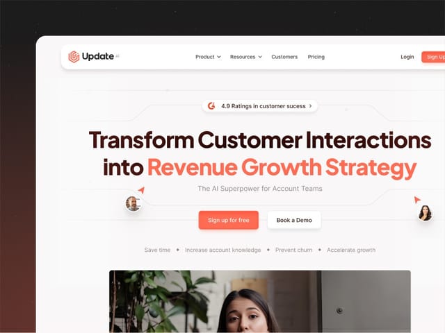
- Update.ai: we designed and built the website for this AI customer-intelligence platform. See the Update.ai project.
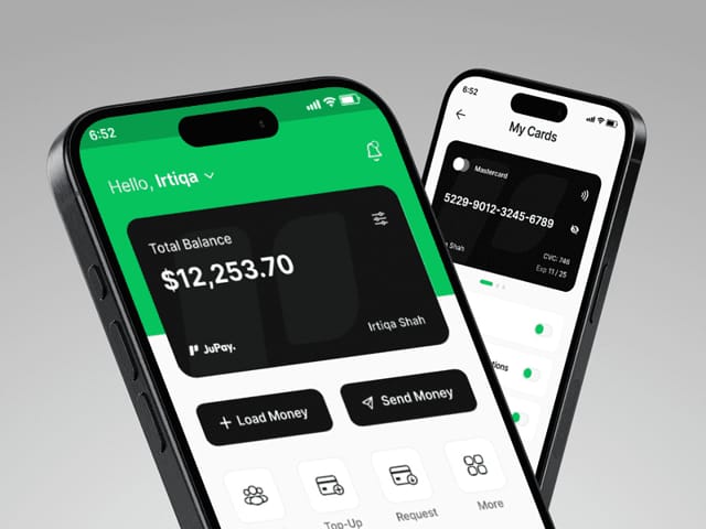
- JuPay: we designed this cross-border mobile finance app, from research to high-fidelity prototypes. See the JuPay project.
- Minexa AI: a product-led website we designed and built for this AI web-data platform. See the Minexa AI project.
What happens on the intro call?
On the free 30-minute call we look at your product, your Figma files and your stack, and ask who ships UI today and where it breaks. We'll tell you honestly whether you need a full system, a smaller UI kit or nothing yet. If it's a fit, you'll get a written plan for the first month of the retainer, or you can start with the $1,000 trial week on one component set.